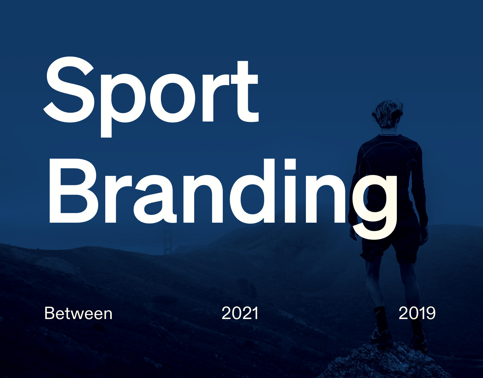
Fol Studio bünyesinde | Kıdemli Tasarımcı
Bu projede Kıdemli Tasarımcı olarak görev aldım ve sürecin tamamından sorumluydum. Araştırma ve konsept geliştirme aşamalarından başlayarak marka kimliğinin ve görsel dünyanın tasarlanması, uygulanması ve tüm teslimlerin eksiksiz şekilde gerçekleştirilmesini yönettim. Proje boyunca müşteriyle doğrudan iletişim kurarak sürecin etkin ve kontrollü ilerlemesini sağladım.
At Fol Studio | Senior Designer
I worked on this project as a Senior Designer and was responsible for the entire process. From research and concept development to the design and implementation of the brand identity and visual language, I oversaw all stages and ensured the complete delivery of all project materials. Throughout the project, I maintained direct communication with the client to ensure a smooth and well-managed workflow.
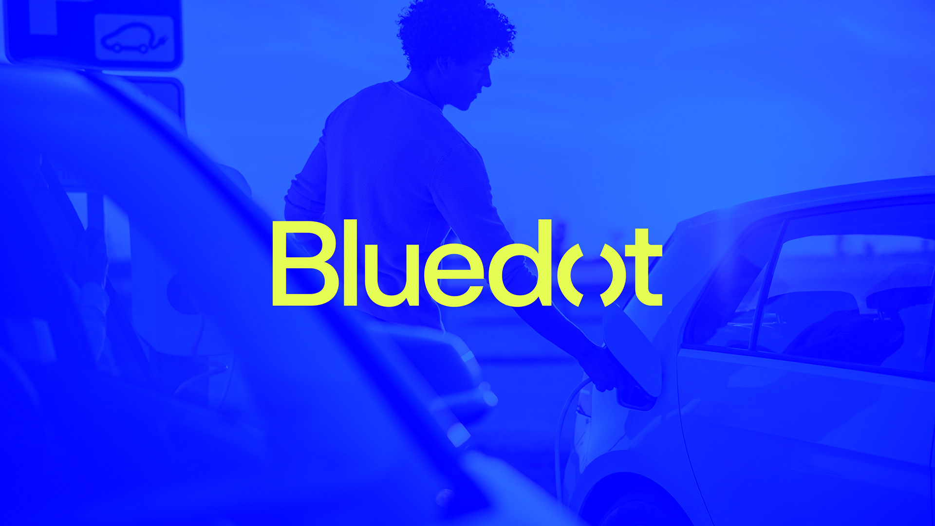
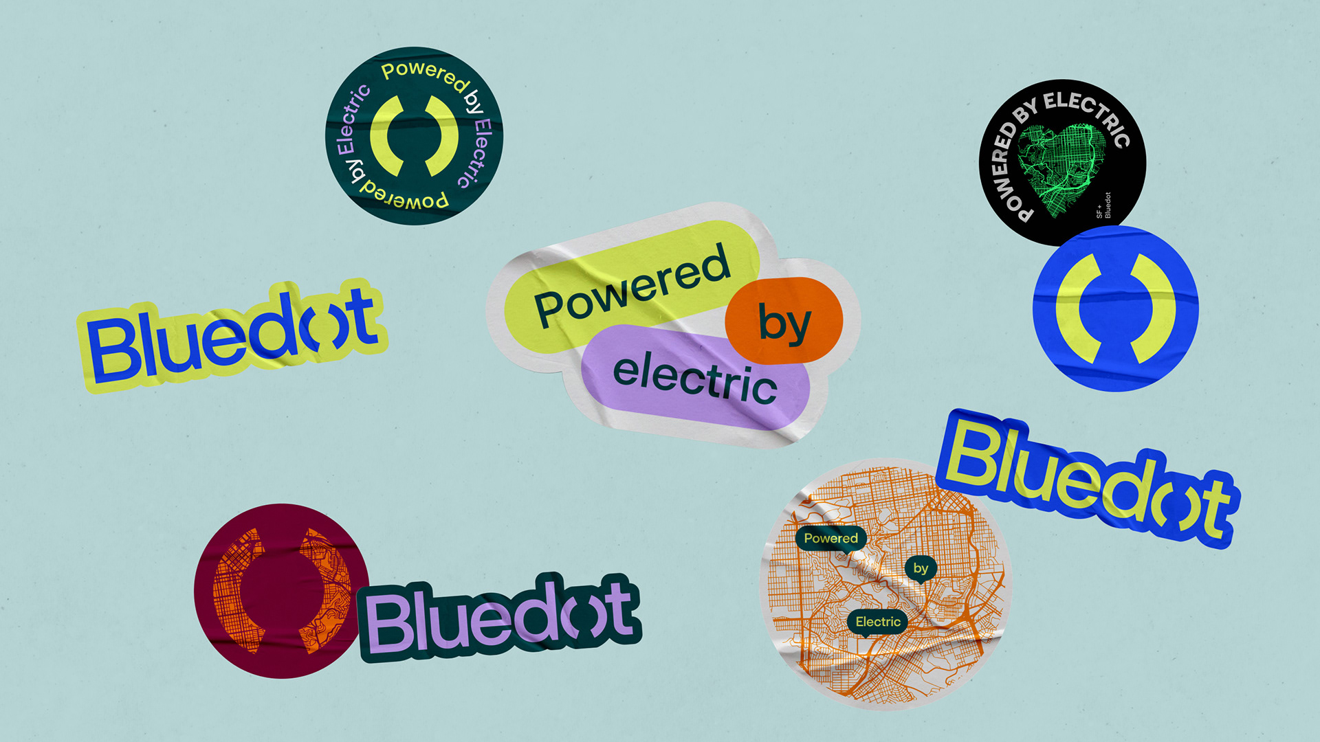
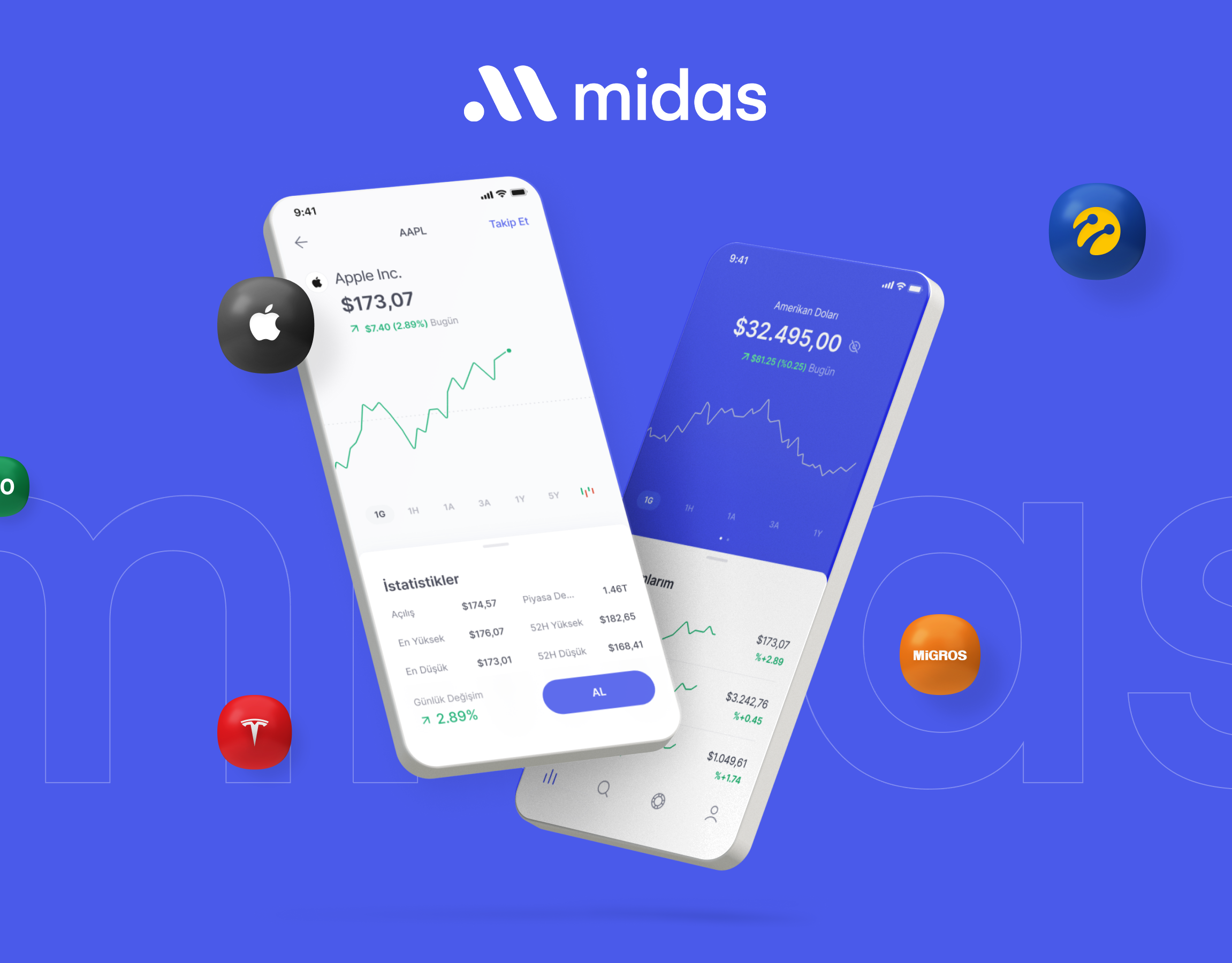
Bluedot
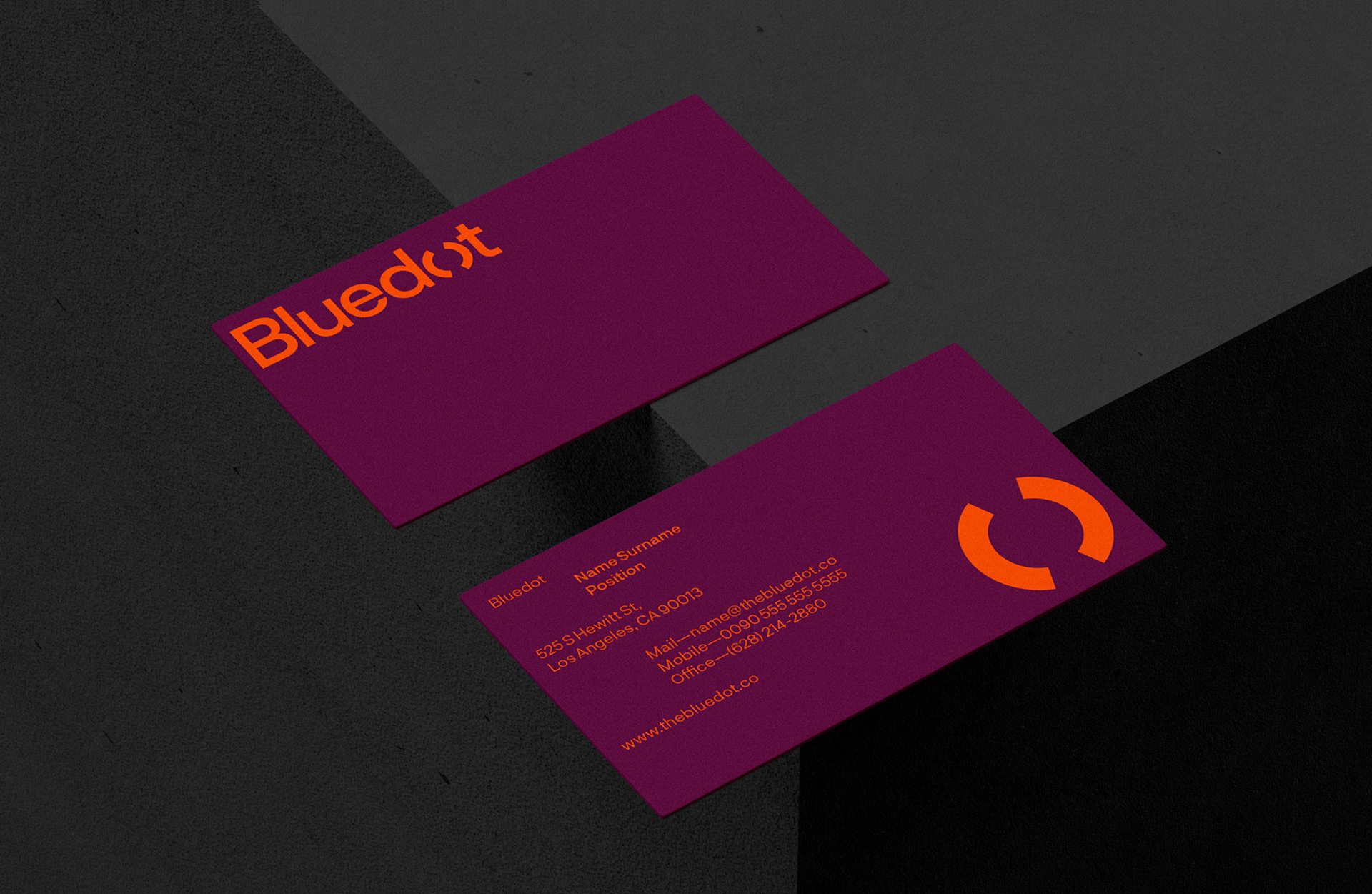
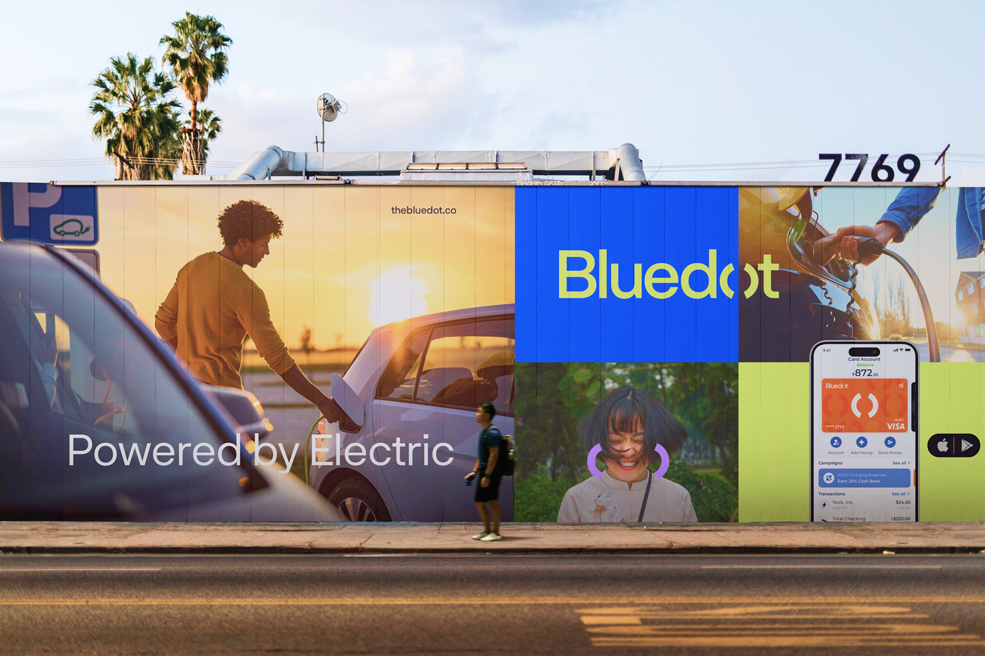
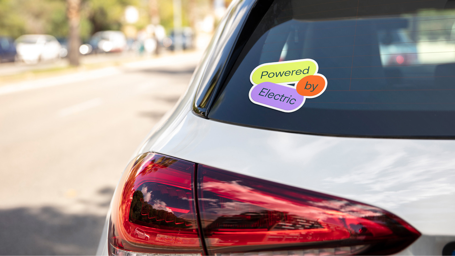
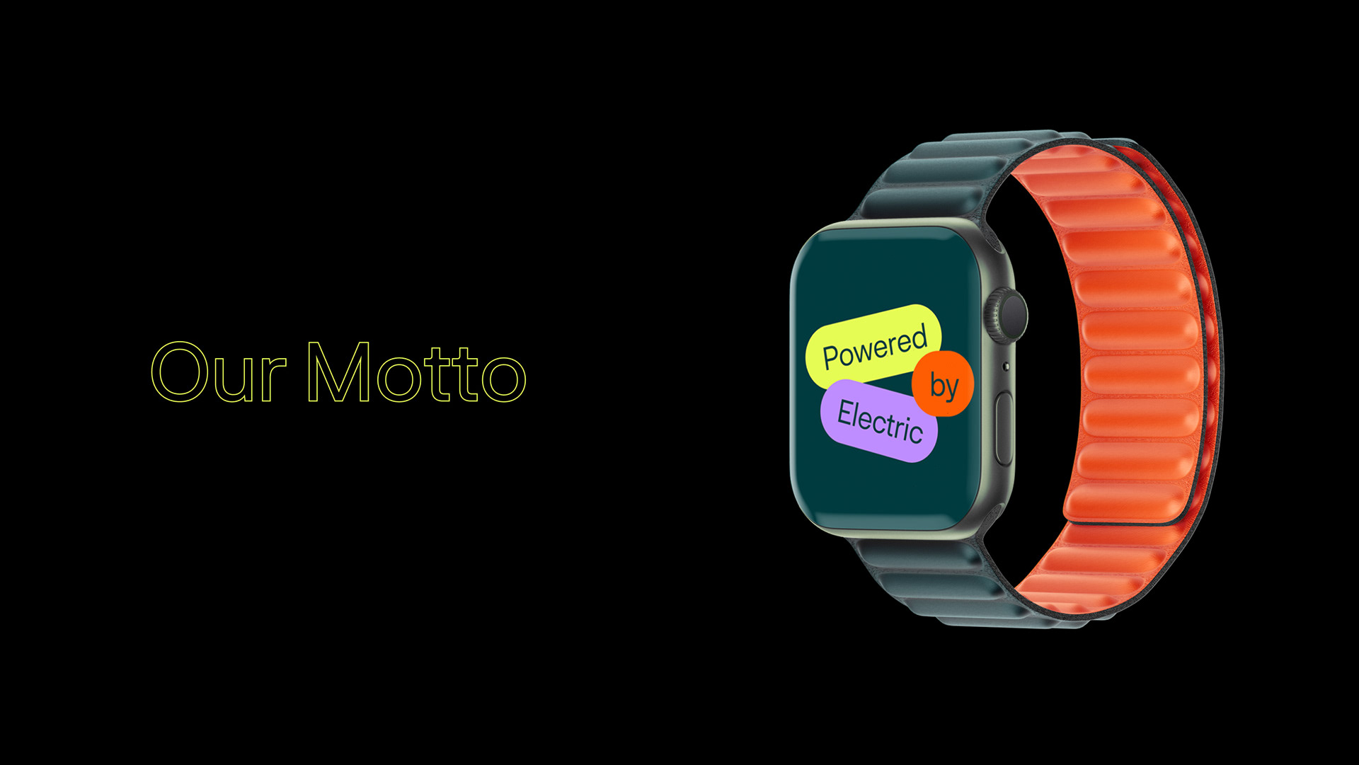
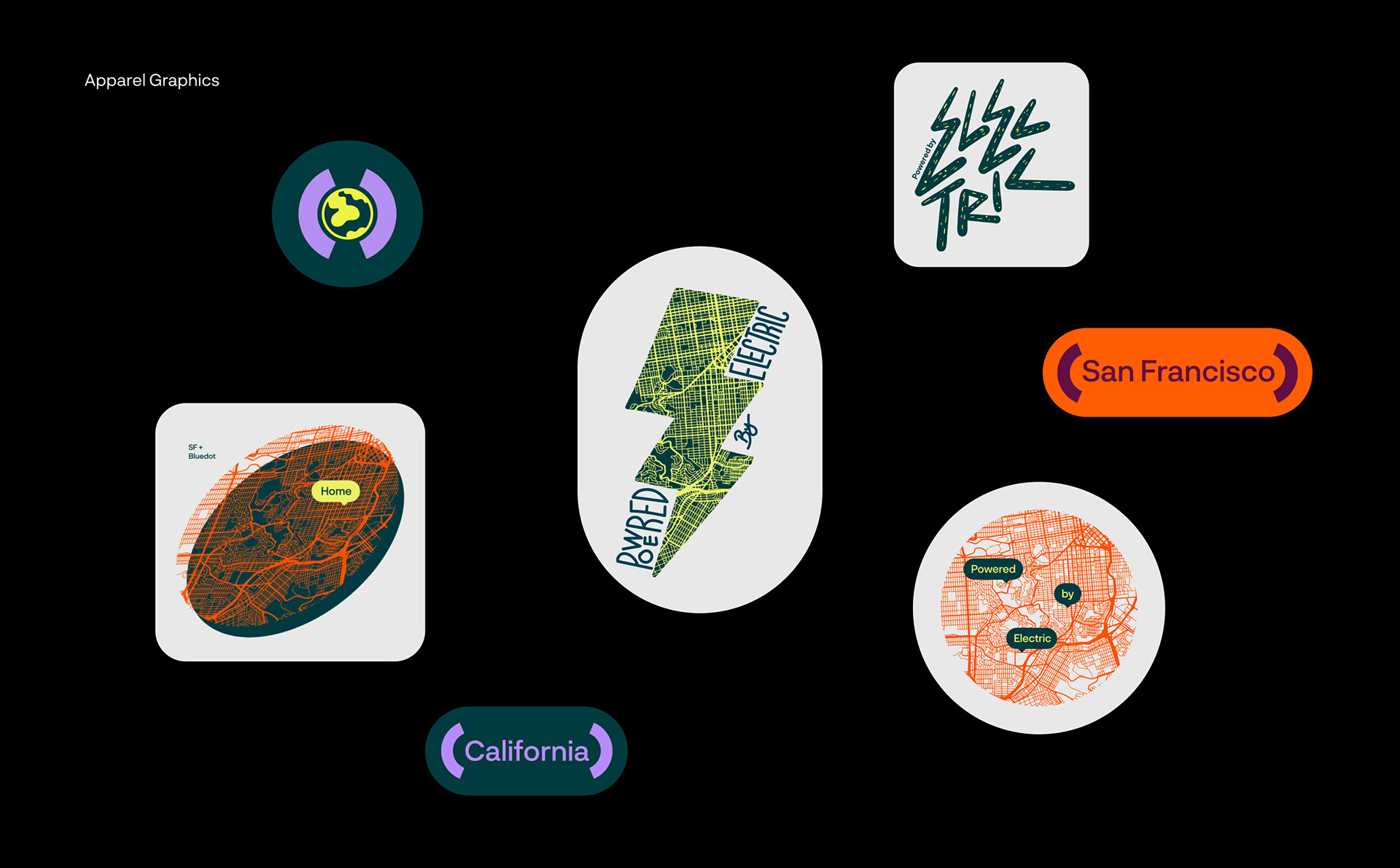
The new brand identity created by Fol, was designed to reflect the energy and spirit of experience which is at the heart of Bluedot. Sense of experience and trust was combined with energetic, premium and eye-catching design, which created the base for the brand personality.
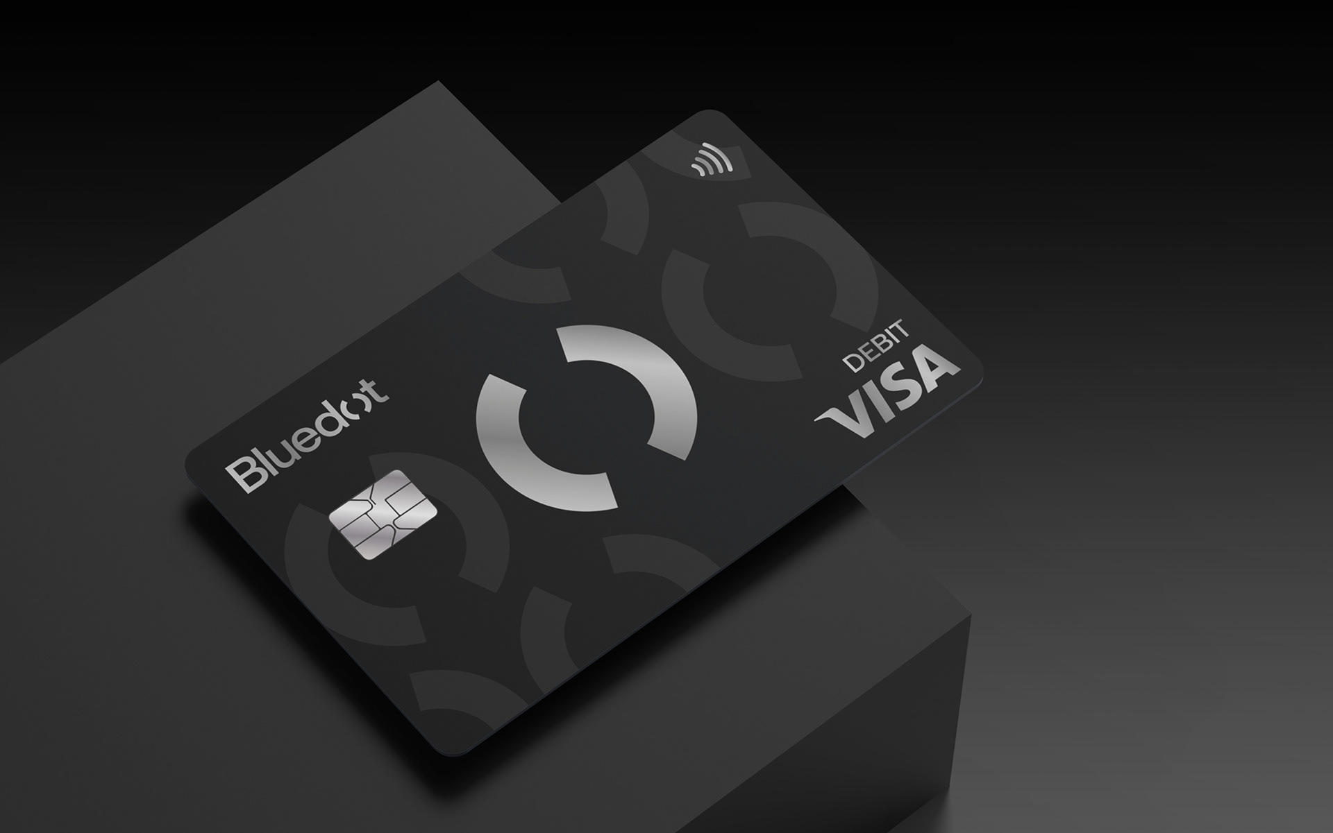
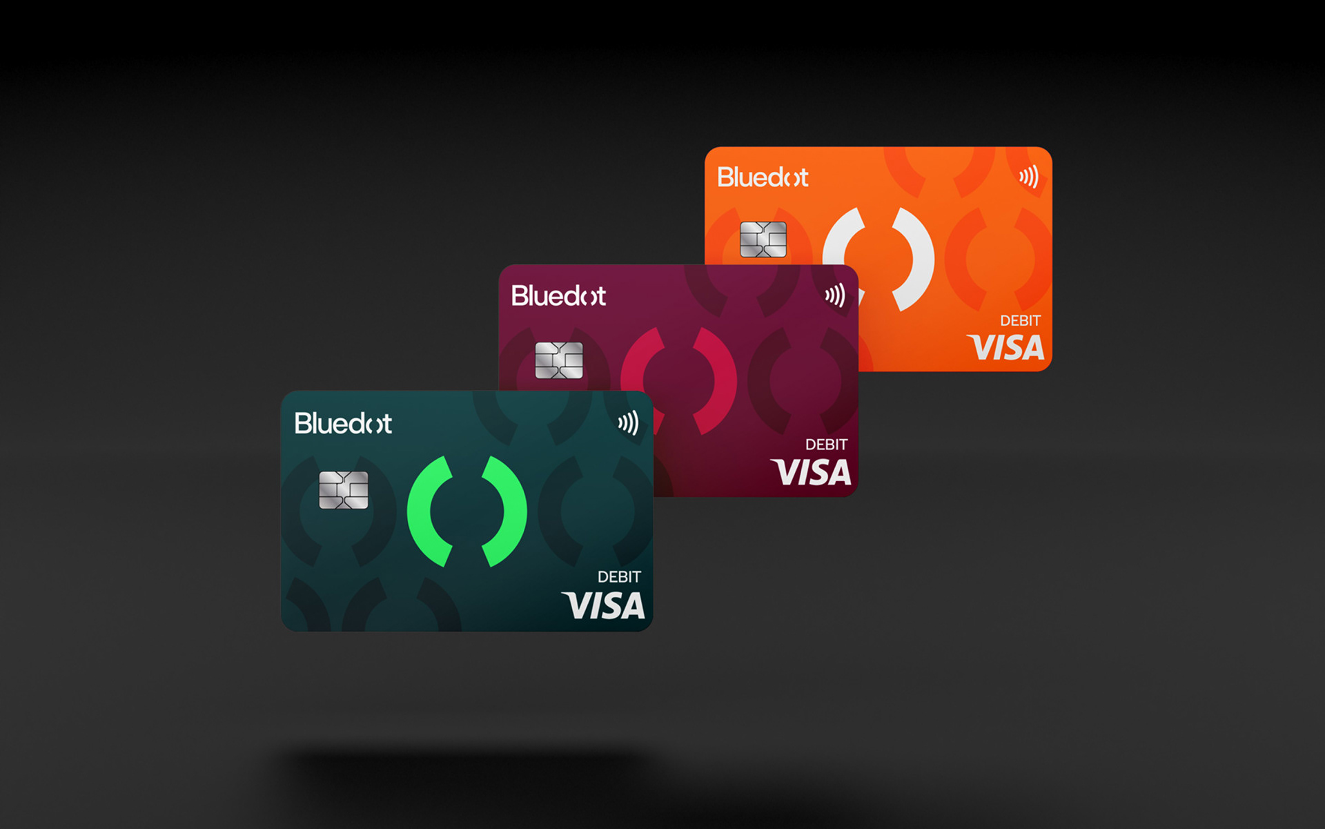
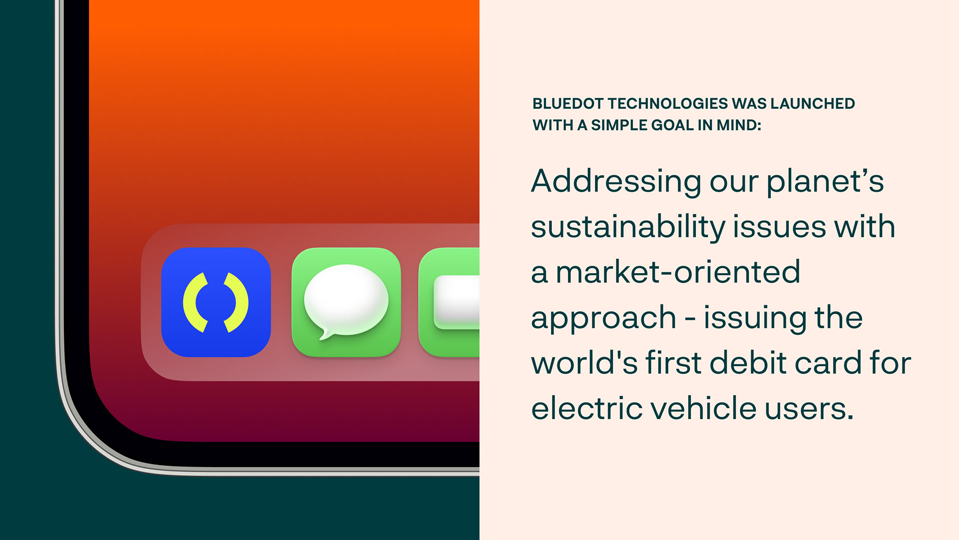
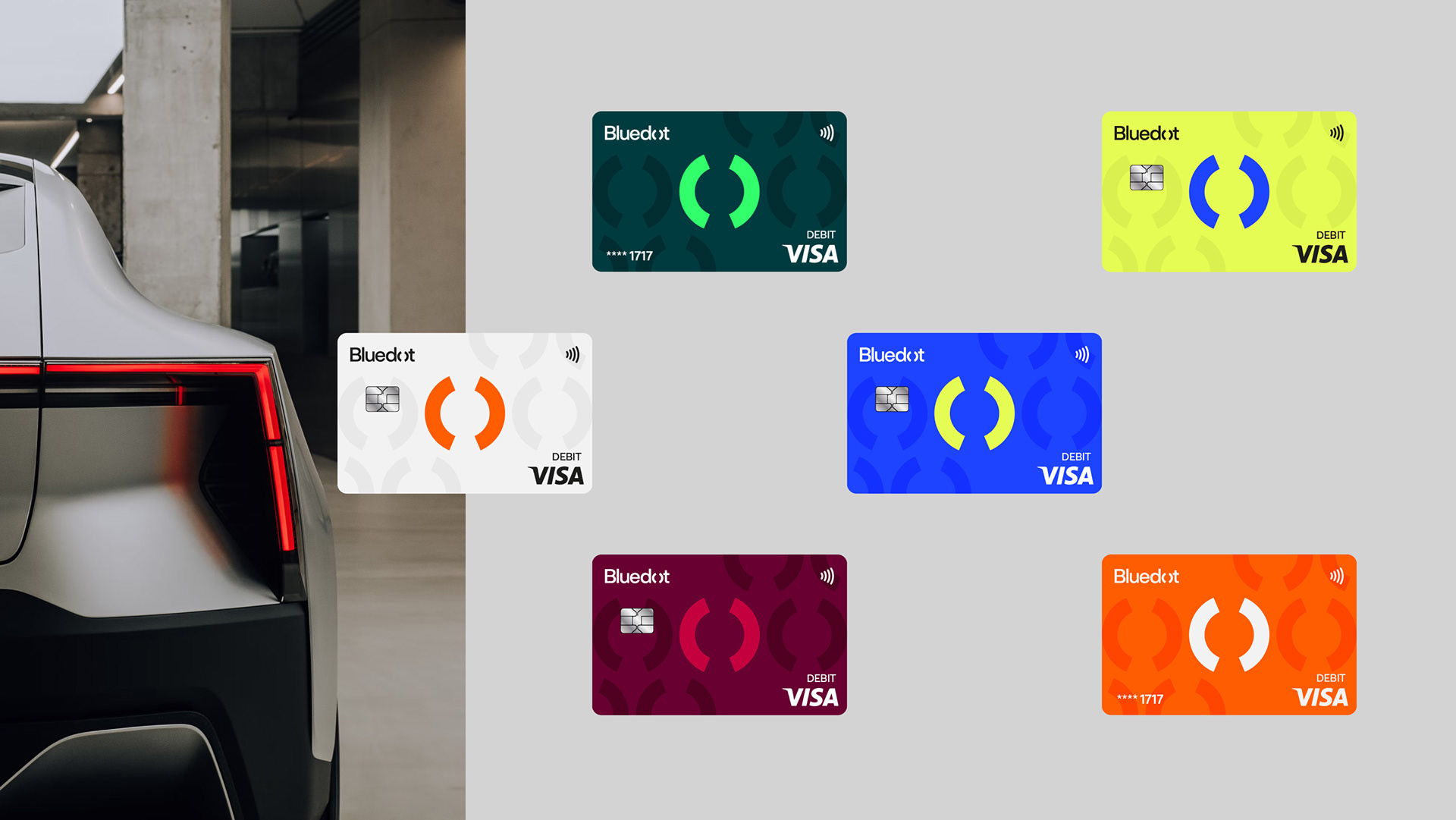
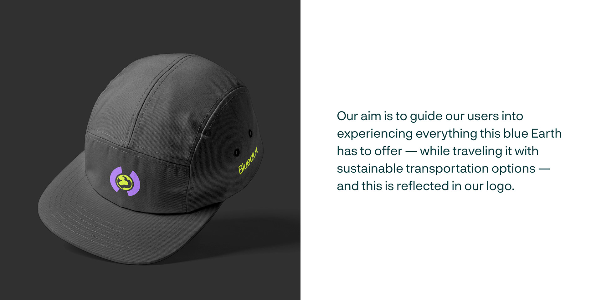
Bluedot's product, which centerest around the experiences of the users, was symbolized with the parentheses, which is used in the letter ‘’o’’ for the logotype and also in the emblem. The parenthesis and the button form which is derived from it, formed the main elements of the visual identity.
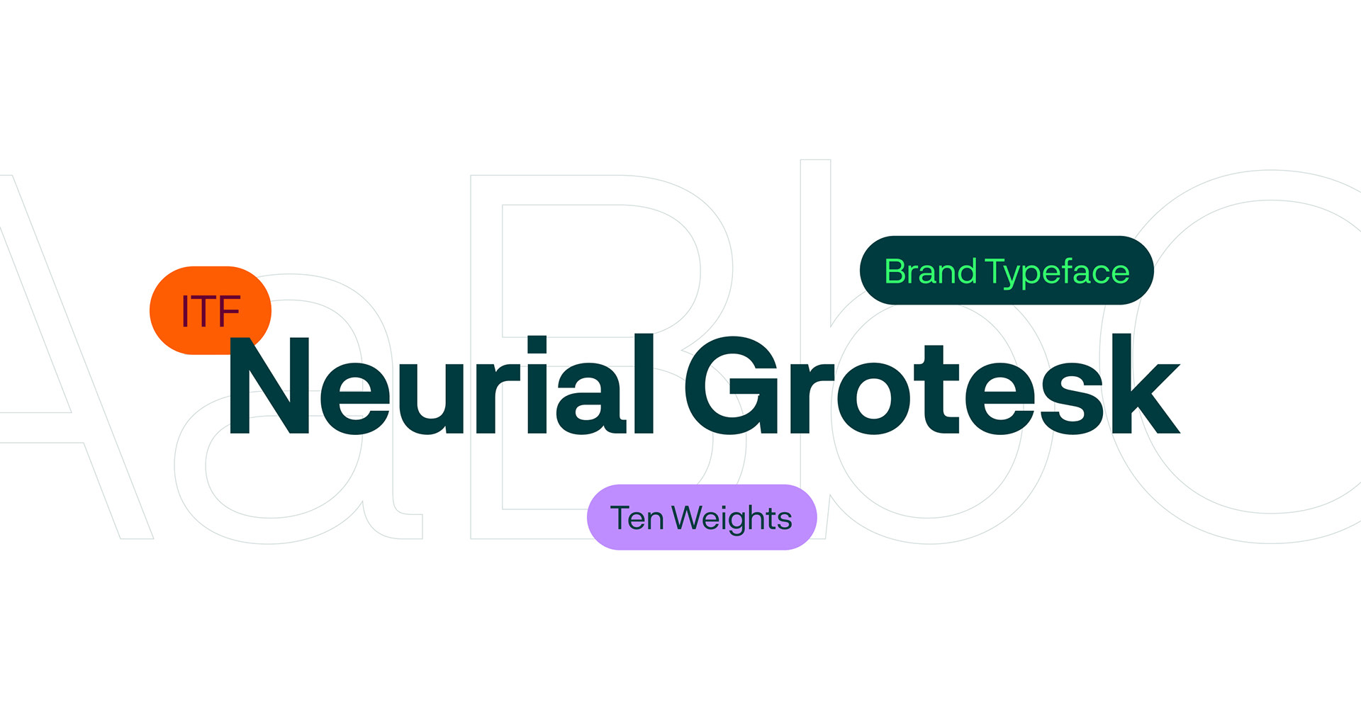
The Neurial Grotesque, a sans-serif font by Indian Type Foundry was used for its balanced and low-contrast structure. To increase readability, the parentheses was edited into a circular form.
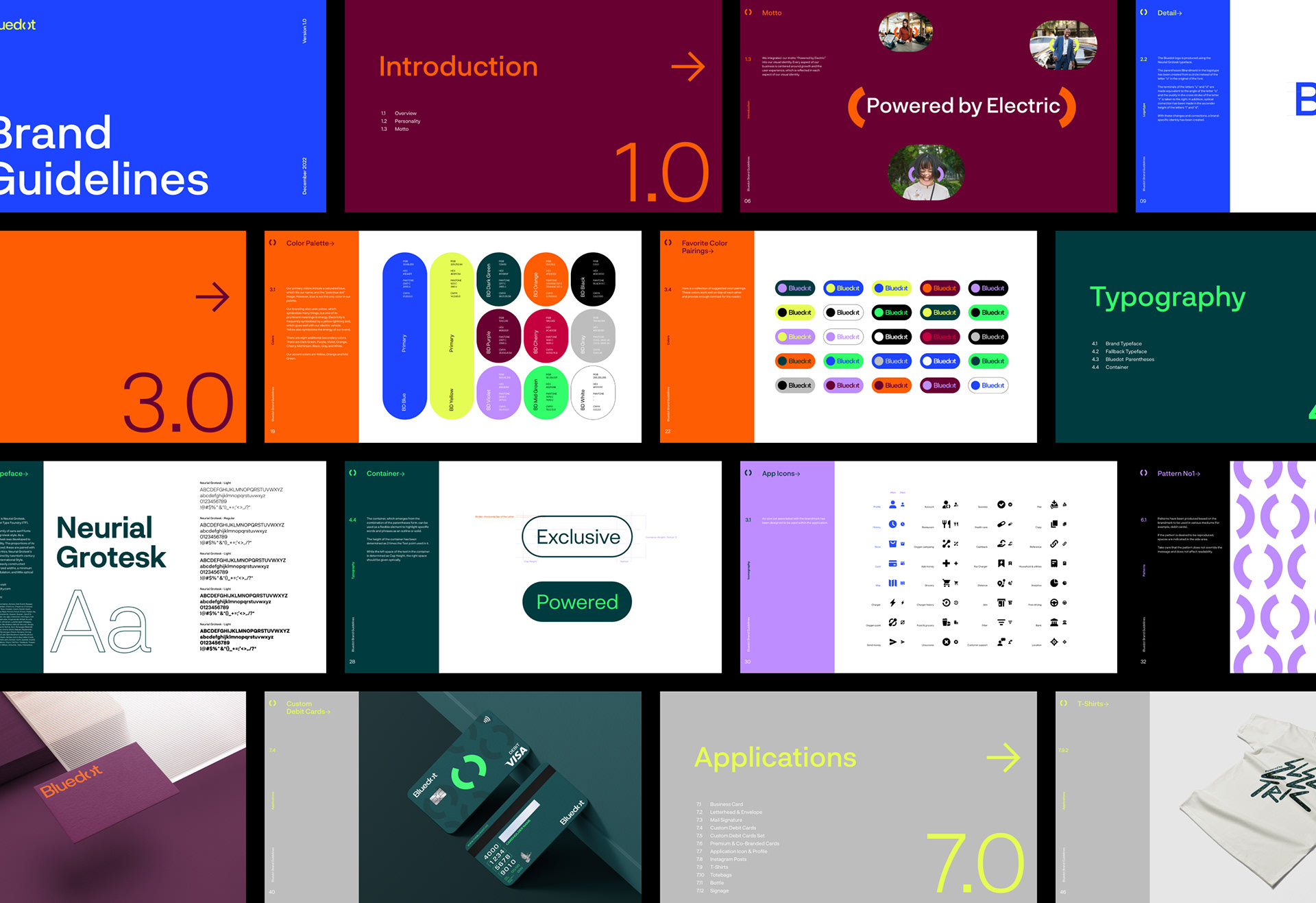
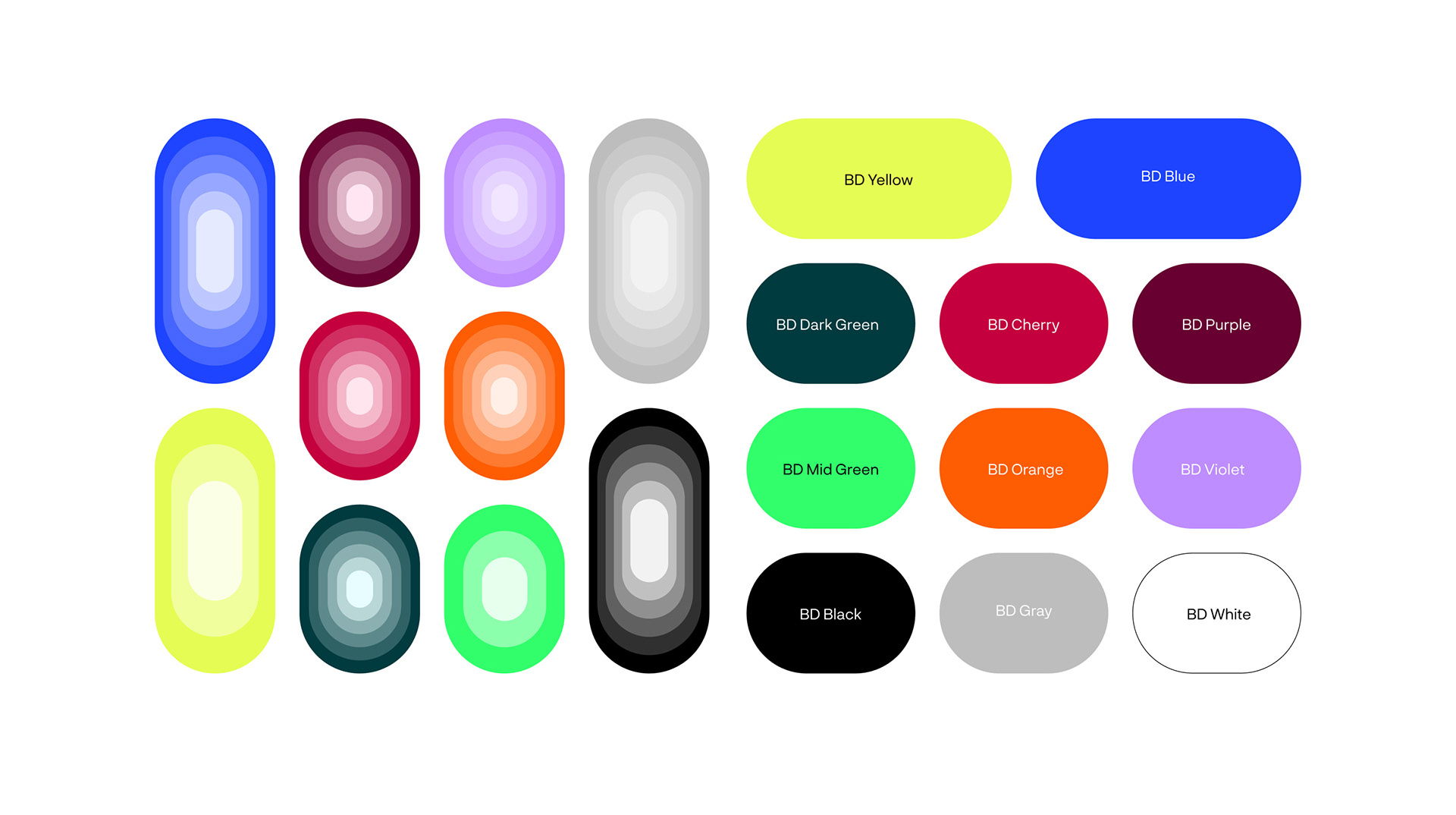
For the main colors; a high saturation Blue was chosen as a reference to blue in the name Bluedot and also as an ode to ‘’pale blue dot’, the Earth. While the yellow was chosen for its representation of the energy of the brand and the electric vehicles. For complementary colors, a wide color palette that reflects the diversity of Bluedot’s experiences has been created. The most suitable pairings from the 10 colors in the palette were chosen, and their uses in B2B and B2C communication were determined.
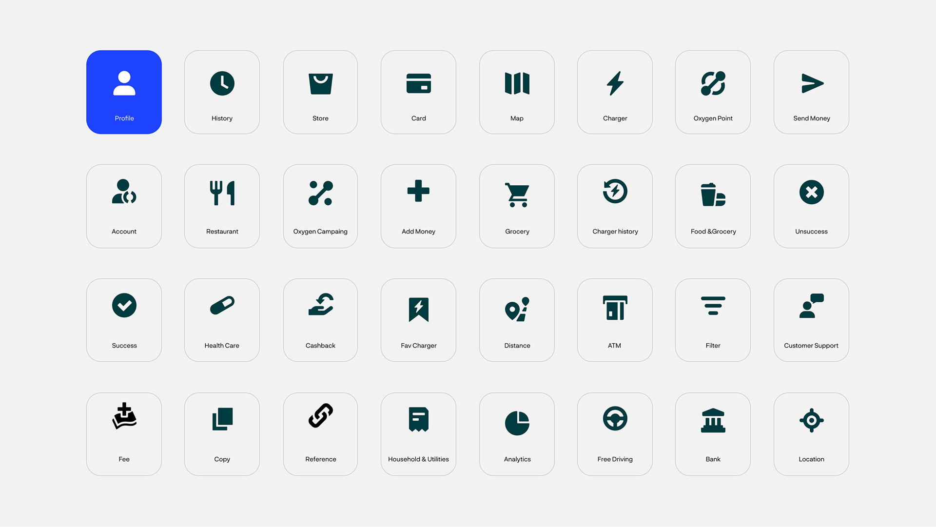
Logos, colors, motto, patterns, uses with photography were created in different uses. The visual word of Bluedot was designed from end to end in order to respond to all the needs in Bluedot’s growth process.